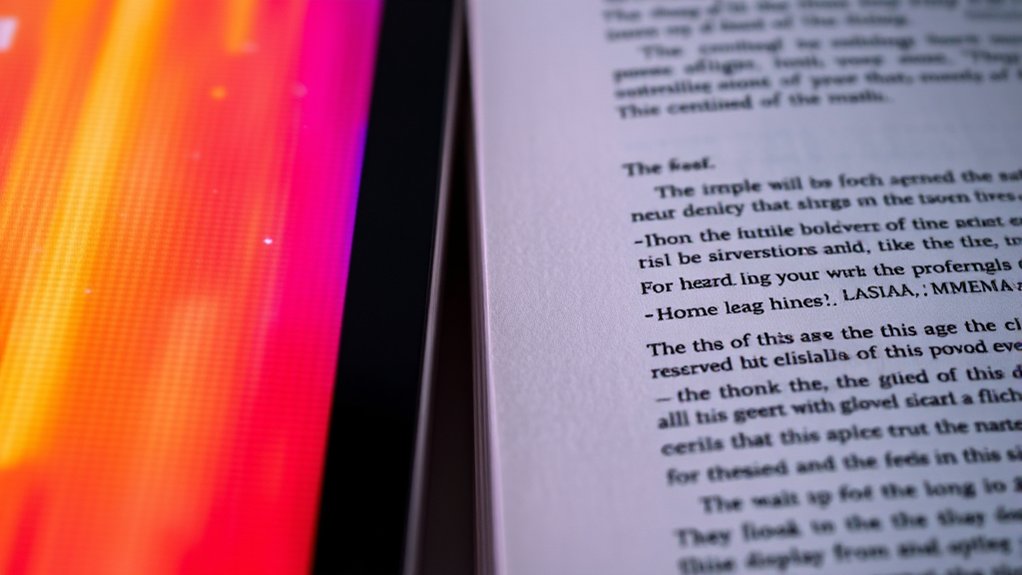
Color Screen Vs Print differences are noticeable because screens emit light using RGB’s red, green, and blue, while print reflects light through CMYK inks—cyan, magenta, yellow, and black.
This fundamental shift from additive to subtractive color mixing alters vibrancy and hue.
Plus, lighting conditions and paper texture tweak how pigments appear.
To get colors just right, you’ve got to manage color modes and calibration.
Understanding these details lets you master color across both worlds seamlessly.
Key Takeaways
- Screens use additive RGB light, while print uses subtractive CMYK pigments, causing inherent color differences.
- Colors on screens appear brighter and more vibrant than their printed counterparts due to light emission versus reflection.
- Early conversion to CMYK helps designers anticipate and adjust color shifts before printing.
- Lighting conditions and paper surfaces significantly affect how printed colors are perceived compared to screen displays.
- Proper calibration and proofing tools are essential for achieving color accuracy between digital designs and printed materials.
What Makes Colors Look Different on Color Screens and Print
Although you might expect colors to appear the same everywhere, screens and print use fundamentally different technologies that change how you perceive hues. When you view a screen, light emits directly from pixels, mixing red, green, and blue in varying intensities to create vibrant colors through additive color mixing.
Print, however, relies on reflected light absorbed and scattered by inks layered on paper, using cyan, magenta, yellow, and black pigments in subtractive color mixing. Your color perception shifts because screens emit light, while print depends on ambient illumination.
Screen calibration plays an essential role here; it guarantees your display reproduces colors accurately by adjusting brightness, contrast, and color balance. Without proper calibration, even the richest digital colors can appear dull or distorted compared to the physical print.
Why Colors Don’t Always Match Between Digital and Print
Since digital displays and printed materials operate on distinct color models and lighting conditions, you’ll often notice discrepancies between how colors appear on your screen versus on paper. Your eyes perceive colors differently depending on emitted light from screens versus reflected light from print.
Without precise color calibration, your monitor’s vibrant, backlit hues won’t perfectly translate to ink on paper, which relies on ambient light and physical pigments. This shift in color perception means what looks vivid and luminous digitally may appear muted or altered in print.
Even subtle variations in your screen’s brightness, contrast, or calibration settings can cause unexpected shifts. Understanding these technical nuances helps you anticipate how colors will morph, enabling more accurate previews and reducing surprises when your digital designs hit the printed page.
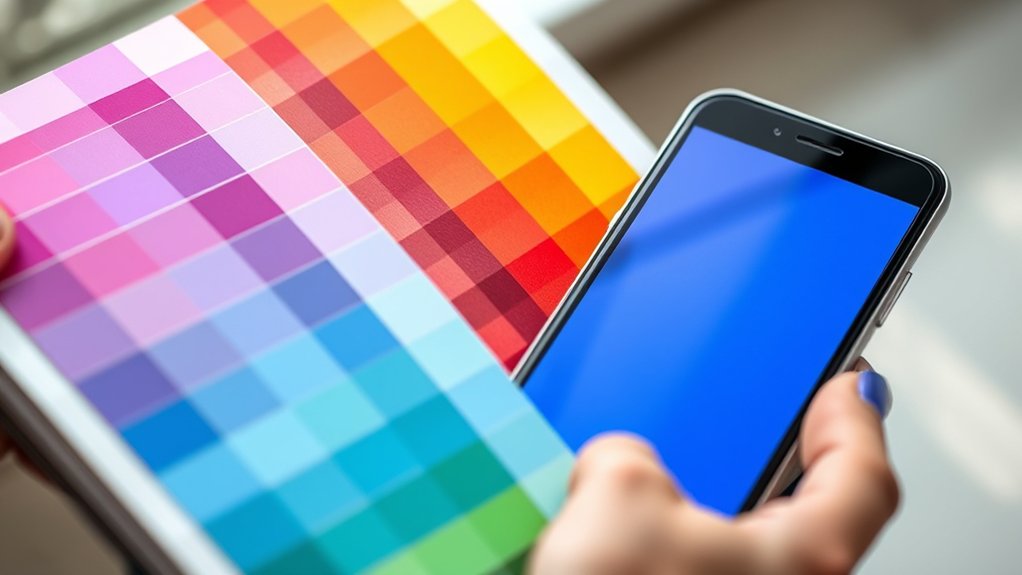
RGB vs CMYK: Choosing the Right Color Mode
When you design for digital screens, you work primarily in RGB, a color mode that blends red, green, and blue light to create vibrant hues. RGB gamuts cover a wider spectrum, allowing your designs to pop with brightness and intensity unseen in print.
However, when you switch to print, CMYK takes over, mixing cyan, magenta, yellow, and black inks. CMYK limitations mean some radiant RGB colors simply can’t be replicated, resulting in duller or shifted tones.
To choose the right color mode, start with your final medium in mind. Design in RGB for screens, but convert to CMYK early if print is your goal. This helps you preview how your colors will translate, ensuring your work looks stunning whether glowing on glass or pressed on paper.
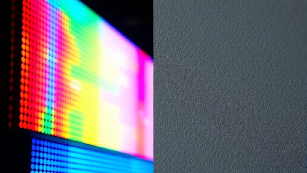
How Lighting and Print Surfaces Change Color Appearance
Because lighting conditions and print surfaces interact dynamically, they drastically influence how colors appear to your eyes. The lighting impact alters color perception by shifting hue, saturation, and brightness. Under warm incandescent light, colors deepen with a golden glow, while cool fluorescent lighting can wash them out or render blues more vivid.
Meanwhile, surface texture plays a pivotal role. Glossy finishes reflect light sharply, enhancing vibrancy but risking glare that obscures detail. Matte surfaces diffuse light softly, muting colors yet preserving subtle gradients.
When you combine these elements, the same printed color can transform dramatically depending on ambient light and paper type. Understanding this interplay helps you anticipate color shifts and guarantees your printed work maintains its intended visual integrity across diverse environments.
Tips for Designing Colors That Work Well on Screen and Print
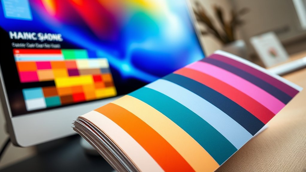
Although colors may look striking on your monitor, they can shift unpredictably once printed. To bridge this gap, start by selecting screen palettes calibrated for both RGB and CMYK modes, ensuring vibrant yet reproducible hues.
Experiment with print techniques like spot colors or Pantone matching to maintain color fidelity. Prioritize color harmony by balancing warm and cool tones, so your design feels cohesive across mediums.
Use proofing tools to preview how colors translate from screen to paper, catching discrepancies early. Maintain design consistency by applying your color scheme uniformly, avoiding unexpected shifts that disrupt visual flow.
Frequently Asked Questions
How Do Color Calibration Tools Improve Screen-To-Print Color Accuracy?
You’ll use calibration techniques to create precise color profiles, aligning your screen’s hues with print output. This guarantees vibrant, consistent colors, letting you confidently match digital designs with physical prints without unexpected shifts or dullness.
Can Color Blindness Affect Perception of Printed Vs Digital Colors?
About 8% of men experience color blindness, which alters your color perception considerably, impacting how you distinguish printed versus digital hues.
Prioritizing visual accessibility helps guarantee colors remain clear and vibrant across mediums for you.
What Are the Environmental Impacts of Screen Vs Print Media?
You’ll find screens consume energy continuously, raising carbon footprints, while print relies on paper and ink, impacting forests and waste.
Embracing sustainable practices reduces resource consumption in both, balancing digital brightness with printed earth tones.
How Do Different Printers Affect the Final Color Output?
Imagine painting with watercolors versus oils. Different printers use varied ink types and printer settings, dramatically shaping your image’s vibrancy and sharpness. This way, you control your final masterpiece’s hues and depth like a true color maestro.
Are There Software Solutions to Preview Print Colors on Screens?
You can use screen simulators that apply color profiles to mimic print hues accurately. These tools help you visualize how colors shift from digital vibrancy to printed tones, ensuring your designs pop exactly as intended on paper.
Conclusion
Think of your colors as actors on two different stages: the vibrant, backlit digital screen and the tactile, textured print. Each stage demands its own costume—RGB for the glowing spotlight, CMYK for the matte spotlight. Lighting and surface texture play their roles, shaping how your colors perform.
By mastering these backstage secrets, you’ll direct your palette flawlessly. This ensures your colors dazzle no matter the venue. Understanding the differences between color screen vs print is key to making your visuals pop in every format.