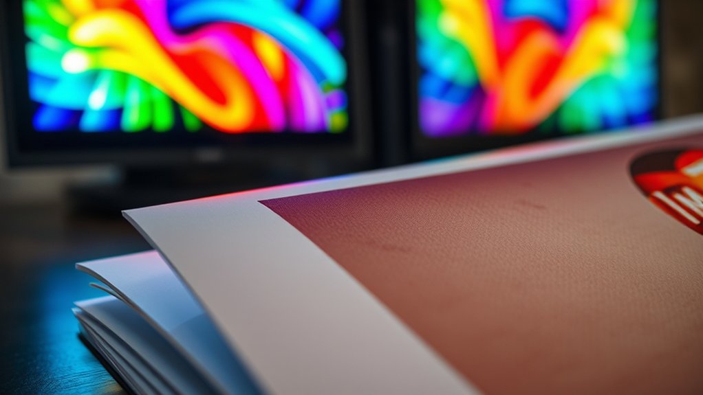
You see CMYK colors differently on screen because monitors use RGB light, while printers mix cyan, magenta, yellow, and black inks on paper, which absorb and reflect ambient light.
This difference in color rendering is why CMYK on screen vs print can look quite distinct.
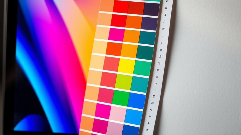
Printed colors often appear less bright and slightly muted compared to their on-screen counterparts. This is due to the physical properties of inks and paper versus the light emitted by screens.
To get accurate previews, you need proper monitor calibration and color profile management.
If you want to master how to prepare and fix CMYK files for printing, understanding these fundamentals is essential.
Key Takeaways
- CMYK colors appear duller and less vibrant in print than the bright, luminous RGB colors on screens.
- Screens emit light (additive RGB), while prints rely on ink absorption and reflection (subtractive CMYK).
- Monitors use RGB to display colors, making accurate CMYK previewing challenging without proper calibration.
- Color shifts between screen and print occur due to differing color gamuts and light interaction.
- Soft proofing and embedding correct color profiles help predict and minimize print color discrepancies.
Why CMYK Colors Differ Between Screen and Print
Although both screens and printers rely on CMYK to reproduce colors, they do so through fundamentally different processes that affect the final appearance. When you view CMYK on a screen, you see light emitted directly, whereas printers apply physical ink onto paper, which absorbs and reflects ambient light. This difference alters your color perception considerably.
Even with rigorous color calibration, the screen’s backlit RGB system doesn’t perfectly simulate the subtractive CMYK ink mix. Calibration adjusts devices to a standard but can’t fully bridge the gap between light-based emission and ink-based reflection.
How RGB and CMYK Colors Change What You See
Because RGB and CMYK operate on fundamentally different principles, additive light versus subtractive ink, they drastically influence how colors appear to you. RGB differences stem from its emission of red, green, and blue light, which combine to create vibrant colors on your screen.
In contrast, CMYK uses cyan, magenta, yellow, and black inks that absorb light, producing colors through pigment layering. This fundamental divergence affects your color perception: RGB colors often look more luminous and saturated, while CMYK colors appear muted and less bright when printed.
When you view the same image in RGB versus CMYK, expect shifts in hue and intensity due to these differing color models. Understanding these differences helps you anticipate how visuals translate from digital displays to physical print.
Previewing CMYK Colors Accurately on Your Monitor
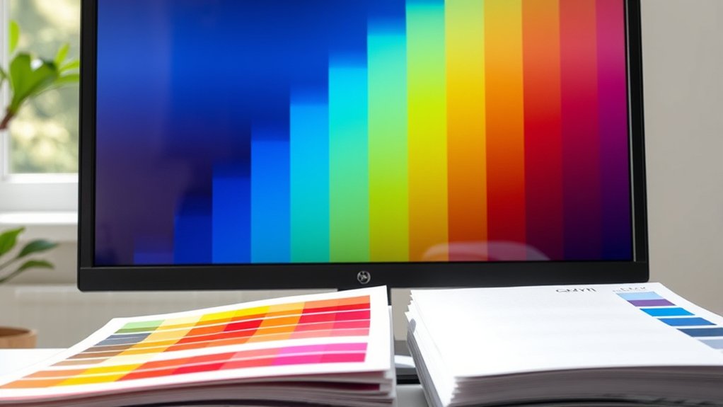
When you preview CMYK colors on your monitor, you face the challenge that screens display colors in RGB, not CMYK. To approach accurate visualization, you must employ calibration techniques that align your monitor settings with industry standards.
Monitors display RGB, so calibrate settings carefully to better visualize CMYK colors accurately.
Start by adjusting brightness, contrast, and gamma to mimic print conditions. Use a colorimeter to measure your display’s output and create a custom ICC profile, ensuring your monitor interprets colors closer to CMYK values.
Software like Photoshop can simulate CMYK gamut within RGB, but relies on precise calibration. Remember, without proper calibration techniques and fine-tuned monitor settings, what you see remains an approximation, not a true representation of the print output.
Regular recalibration maintains consistency, critical for reliable CMYK previews before finalizing your designs.
Preparing Your Designs for Accurate CMYK Printing
To guarantee your designs translate accurately from screen to print, you need to prepare files specifically for the CMYK color space. Start by setting your design software’s color mode to CMYK, ensuring all elements conform to print standards. Calibrate your monitor regularly to maintain consistent color perception, matching on-screen hues to printed output.
Use color profiles embedded in your design files to communicate precise color values to printers. Convert any RGB images to CMYK to avoid unexpected shifts in color. Pay attention to total ink coverage limits to prevent oversaturation and smudging.
Before exporting, flatten transparencies and embed fonts to preserve detail. By meticulously managing these technical aspects, you’ll produce print-ready artwork that mirrors your on-screen vision with fidelity and accuracy.
Fixing Common CMYK Color Issues Before Printing
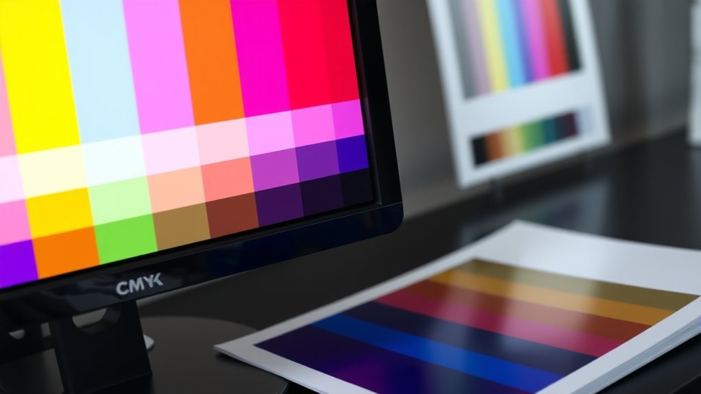
Although preparing your files correctly reduces errors, you’ll still encounter common CMYK color issues that require correction before printing. First, make sure your monitor undergoes precise color calibration to reflect true CMYK hues accurately. Without this, what you see on screen won’t match the printed result.
Next, double-check that your design uses the correct color profiles, such as U.S. Web Coated SWOP or ISO Coated, matching your printer’s specifications. Misaligned profiles often cause dull or overly saturated prints.
Use soft proofing in your design software to simulate how colors will appear once printed, catching issues early. Finally, adjust problematic colors manually, like reducing excessive cyan or magenta in shadows, to prevent ink bleeding or color shifts, making certain your print output mirrors your on-screen vision faithfully.
Frequently Asked Questions
Can CMYK Colors Be Used for Digital Animations?
You can’t use CMYK directly for digital animations because screens rely on RGB. To guarantee accurate color fidelity, convert CMYK colors to RGB, preserving vibrant visuals and seamless animation across digital devices and platforms.
What Printing Materials Affect CMYK Color Accuracy?
You’ll notice ink formulation and color profiles greatly impact CMYK accuracy on materials like coated paper, uncoated stock, and plastics. Different surfaces absorb ink variably, so calibrate profiles to maintain precise, vibrant color reproduction.
How Does Paper Type Influence CMYK Print Outcomes?
You’d think all paper’s just paper, but the finish drastically shifts CMYK’s color consistency. Glossy’s vibrant, matte’s muted, and uncoated soaks ink unpredictably, turning your masterpiece into a moody, unpredictable canvas. Choose wisely!
Are There Software Tools for Converting RGB to CMYK?
You can use software like Adobe Photoshop or Illustrator for RGB conversion; they let you apply specific color profiles to guarantee precise CMYK output.
These tools simulate print colors accurately before finalizing your design.
Does Ambient Lighting Affect How Printed CMYK Colors Appear?
Yes, ambient lighting greatly affects your color perception of printed CMYK colors. Different lighting conditions alter how pigments reflect light, so you’ll see variations in hue, saturation, and brightness depending on the environment’s illumination.
Conclusion
Understanding why CMYK colors look different on screen versus print is essential for achieving accurate results. You’ve seen how RGB and CMYK color models affect what you perceive, and how to preview and prepare your designs to minimize surprises.
So, why settle for guesswork when you can control color precision? By mastering these steps, you guarantee your printed work matches your vision, avoiding costly mistakes and delivering vibrant, true-to-life results every time.
In the end, understanding CMYK on screen vs print is key to ensuring your colors come out exactly as intended.